Your maple kitchen cabinets are gorgeous; but choosing the right colors around them is where the real work happens.
I’ve discovered that the golden honey tones in maple respond beautifully to specific color partners, and getting this right changes your entire kitchen’s feel.
The lighting in your space, your countertop choices, and even bold accent colors all play important roles.
Let me show you exactly how to make these elements work together harmoniously.
Test Paint Colors Across Your Kitchen’s Lighting

Why does that gorgeous paint sample you loved in the store look completely different on your kitchen wall? Lighting changes everything. I’ve discovered that testing paint colors across your kitchen’s natural, incandescent, and LED lighting reveals the truth about how shades interact with your maple cabinets.
Lighting changes everything. Test paint colors across natural, incandescent, and LED lighting to reveal how shades interact with your maple cabinets.
I recommend purchasing large swatches—11 by 7 inches—and placing them near your cabinets for several days. Watch how the colors shift from morning to evening. Your maple’s warm undertones will look different under each light source.
Narrowing to two or three paint colors before committing prevents expensive mistakes. I’ve learned that front-end tester boards placed strategically show genuine contrast and harmony with your trim and flooring.
This approach replaces guesswork with confidence, so your final color choice works perfectly in your space.
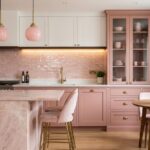
Warm Color Schemes That Complement Maple Tones

How can you make your maple cabinets really shine? I’ll show you warm color schemes that create a welcoming kitchen you’ll love.
Your maple cabinets have gorgeous golden honey undertones that deserve the right companions. Here’s what works beautifully:
- Pair maple with terracotta and cream for a cozy, traditional kitchen feel that invites everyone inside
- Choose warm neutrals like beige, taupe, and soft white to enhance depth without overpowering your wood grain
- Add wall colors in sage, warm gray, or soft amber to maintain consistent flow throughout your home
I recommend avoiding cool, stark colors that clash with maple’s natural warmth. Instead, opt for warmed variants of gray or white to preserve tonal harmony.
These warm neutrals create the inviting atmosphere your family deserves, making your maple cabinets the beautiful centerpiece they should be.
Cool Tones: Adding Modern Contrast to Maple

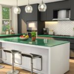
If you’re ready to shake things up, navy blue walls create striking contrast that makes your maple cabinets stand out with modern sophistication. I recommend pairing cool gray accents, such as matte hardware and sleek countertops, to balance the warmth of your wood and keep everything feeling unified throughout your kitchen.
Test these bold colors in natural light before you commit, so you’ll see exactly how they affect your space.
Navy Blue Wall Elegance
Imagine walking into your kitchen and discovering walls painted in a striking navy blue. Your maple cabinets would become the focal point of the room. You’re creating a sophisticated space that feels both modern and welcoming.
Navy walls showcase your maple cabinets’ golden warmth beautifully. Here’s what makes this pairing so compelling:
- Neutral countertops like white or cream balance the drama while letting wood grain shine
- Light flooring in beige tiles or pale hardwood prevents the space from feeling cramped
- Strategic accent walls behind open shelving add depth without overwhelming your design
Test paint samples in your kitchen’s natural and artificial light first. Navy can read too dark at night, so you’ll want confidence in your choice.
When you pair navy walls with warm maple, you’re joining countless homeowners who’ve discovered this classic, elegant combination that works well.
Gray And Cool Accents
While navy walls bring classic sophistication to maple cabinets, cool gray tones offer a more modern edge that refreshes your kitchen’s entire vibe. I’ve discovered that medium gray countertops or wall colors create the perfect balanced backdrop for maple’s golden honey hues without any clashing.
Here’s what makes gray work so well: it complements your maple cabinets while keeping them from feeling overwhelmed. You’ll want to incorporate cool accents strategically through hardware, backsplashes, and accessories. Think charcoal or matte black fixtures paired with your warm wood tones.
The key is to use cool accents in small doses. A marble backsplash or cool-toned white walls preserve maple’s warmth while adding a contemporary feel to your space. This approach gives you that modern edge you’re seeking without sacrificing the comfortable appeal your maple cabinets naturally deliver.
Bold Accent Colors for Maple Kitchens

I’ve found that deep navy blue creates striking drama when you pair it with maple cabinets, giving you modern contrast without overwhelming the wood’s natural warmth. You’ll want to test large color samples in your natural lighting first; this simple step confirms whether navy or charcoal accents truly work with your specific maple before you commit.
Skip overly warm marsala tones and instead embrace these cooler, bolder palettes that homeowners love for their sophisticated, timeless appeal.
Navy Blue Drama Creation
Why settle for ordinary when navy blue can bring drama to your maple kitchen?
Navy blue creates the perfect dramatic contrast against warm maple cabinets. I’m convinced this timeless pairing delivers bold visual impact without overwhelming your space. Here’s what makes navy work:
- Creates striking focal points – Navy acts as a versatile neutral that coordinates beautifully with your maple’s golden honey tones
- Pairs perfectly with complementary accents – Brass or brushed nickel hardware enhances the entire look while maintaining balance
- Works across different lighting – Test samples in natural light to confirm harmony throughout your day
You’ll achieve a sophisticated kitchen by combining navy blue maple cabinets with light, neutral countertops. This combination brings drama and elegance together seamlessly. Your maple kitchen deserves this bold transformation.
Contrasting Color Coordination Strategies
How can you make your maple cabinets stand out? I’ve discovered that bold accent colors create striking contrasts that enhance your kitchen’s warmth. Pair darker finishes like espresso or charcoal with maple cabinets for rich depth without overwhelming the wood’s golden honey tones.
Consider these contrasting color strategies. Use cooler gray tile or charcoal wood-look flooring to delineate spaces and showcase the maple’s beautiful grain. Bold hardware in matte black, brass, or brushed nickel introduces strong visual interest while preserving warmth.
Here’s my best tip: sample colors in natural light before committing. Your maple cabinets deserve accent choices that work well with their undertones, not clash against them. You’re creating a kitchen with visual harmony that reflects your personal style and belongs in your home.
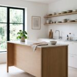
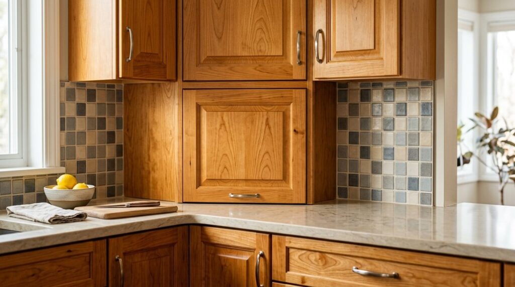
Coordinating Countertops and Flooring With Maple

When it comes to creating a kitchen that truly shines, your countertops and flooring choices matter just as much as your maple cabinets.
You’ll love how these elements work together to complete your design:
- Quartz countertops offer durability and low-maintenance elegance that pairs beautifully with maple’s warmth
- Light hardwood flooring creates a unified look that flows seamlessly throughout your space
- Contrasting flooring makes your maple cabinetry stand out and become the focal point
I recommend choosing materials that harmonize with maple’s golden honey tones. Light or matching hardwood brings everything together naturally. If you prefer contrast, darker flooring draws attention to your gorgeous cabinets.
Even LVP flooring works when colors align with your wood trim. Before committing, gather samples and photos showing maple with quartz and complementary flooring. This visualization helps you see your complete kitchen design come to life.
Paint Colors That Remain Timeless With Maple

Your beautiful maple cabinets deserve wall colors that enhance, not compete with them. I’d recommend cream or light gray; these neutral shades let your wood’s warmth shine. Here’s the key: pay attention to undertones. Beiges and whites with warm undertones work beautifully with maple’s golden honey tones.
Navy blue is another timeless choice I love. It’s versatile and bold without overwhelming your space. This color allows you to experiment with striking accent colors in accessories or countertops.
Before committing, test large color swatches on your walls. Check them during different times of day in natural light. You’ll see how they truly coordinate with your maple and wood trim.
This approach helps your paint choice remain timeless for years ahead.