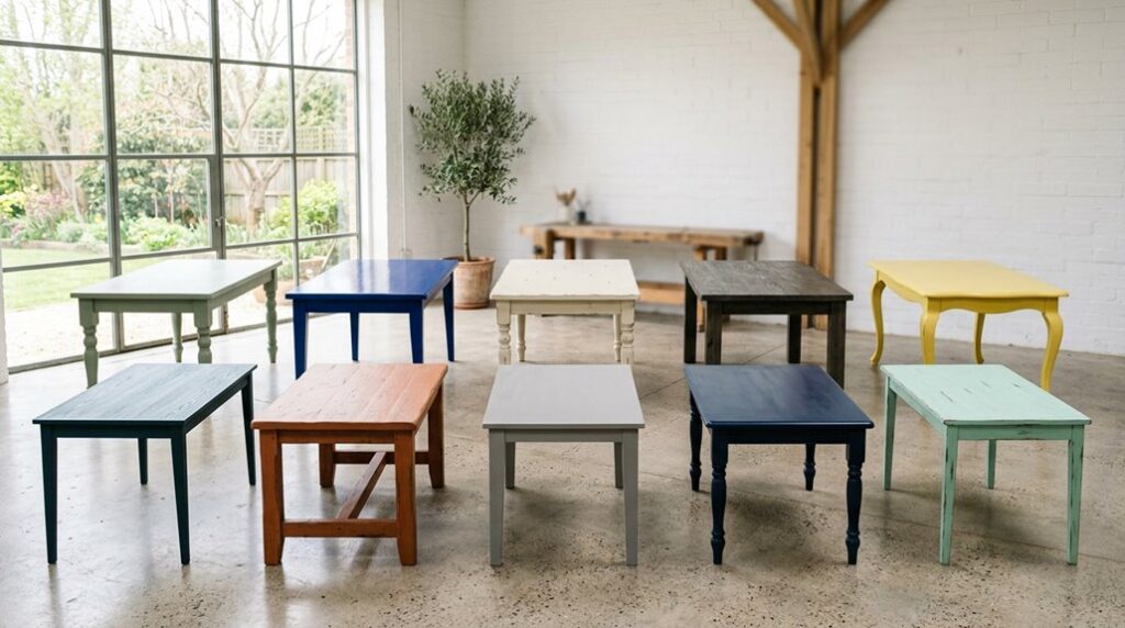
I never expected that the moment I decided to repaint my kitchen table would spark a complete design shift. Your dining space deserves more than just a functional surface; it deserves personality. Whether you’re drawn to bold navy statement colors, striking two-tone contrasts, or interactive chalkboard finishes, painted tables offer endless possibilities.
The real impact happens when you combine your chosen color with the right protective seal. Let me show you nine more ideas that’ll make your kitchen the heart of your home.
Single-Tone Statement: Bold Color for Maximum Impact

Why settle for a forgettable dining table when you can create a notable focal point? A single-tone statement brings rich colors like navy or forest green into your space. These bold hues ground compact dining areas and anchor your entire room’s design.
A single-tone statement table in navy or forest green grounds your dining area and anchors your entire room’s design.
Here’s what makes this approach work: you’re choosing one impressive color without contrasting tops or bases. This keeps your design cohesive and intentional. The boldness demands durability, though.
I recommend high-quality finishes that withstand daily use while preserving color vibrancy. Surface preparation matters tremendously. A solid sealant prevents chipping and dulling over time. You’re investing in longevity.
This strategy keeps things simple yet striking. You’ll avoid overwhelming your space while creating unmistakable personality. Your table becomes the conversation starter your dining area deserves.
Two-Tone Design: High-Impact Color Contrast

How can you create a striking centerpiece with a simple table? A two-tone design delivers exactly that impact. I pair a dark espresso or matte black tabletop with a crisp white or cream base. This bold contrast creates visual drama while keeping your space feeling balanced and organized.
You’re not limited to solid colors either. Try adding subtle patterns or color blocking on the top to enhance the effect without overwhelming your dining area. The key is letting that tabletop shine as your main point of interest.
To complete the look, I coordinate matching chairs in complementary colors. This unifies your entire dining space beautifully.
Durability matters too. Use a robust primer and non-yellowing sealant on your painted top. This protects against daily wear while maintaining that gorgeous two-tone design for years.
Chalkboard Paint: Interactive Surface for Family Dining

Since your kitchen table is where your family gathers, why not make it a space that invites creativity and connection? Chalkboard paint turns an ordinary table into an interactive surface that brings joy and engagement. You’ll love how it becomes a canvas for family menus, inspiring quotes, and kids’ artwork.
| Feature | Benefit | Maintenance |
|---|---|---|
| Writable Surface | Daily creativity | Regular cleaning |
| Color Options | Design flexibility | Chalk conditioning |
| Family-Friendly | Bonding moments | Clear topcoat sealing |
This finish works well in casual dining spaces and pairs beautifully with coordinated chair colors that unify your kitchen’s scheme. Keep your chalkboard looking fresh through routine maintenance and occasional reconditioning.
Apply a protective clear topcoat to guard against smudges between uses. Your family will gather closer around this bold, interactive centerpiece.
Distressed Finish: Layered Paint for Vintage Charm
If you’re craving that charming, lived-in look that only time can create, a distressed finish delivers authentic vintage appeal without waiting decades. I’m talking about layering multiple paint colors, then strategically sanding between coats to reveal what’s underneath.
Here’s how I’d approach it: start with a base coat, then apply lighter top colors in uneven patches. This mimics natural wear beautifully. Sand edges and corners most, where furniture naturally gets bumped and touched. Keep the center more intact for balance.
The special quality emerges when you seal everything with wax or glaze. This enhances that aged patina without adding heavy shine. Pair your distressed finish with matte or satin sheens, never high-gloss. You’ll create a table that feels genuinely vintage and inviting, the kind everyone wants to gather around.
High-Gloss Lacquer: Luxury for Formal Settings

If you want to redesign your dining room into something truly striking, consider high-gloss lacquer paired with jewel tones like emerald or sapphire. The reflective shine amplifies these rich colors beautifully. You’ll need to commit to regular maintenance, though, since fingerprints show easily on that mirror-like surface, making this finish perfect for tables you use occasionally rather than daily.
The key to pulling off this luxurious look is meticulous prep work: sand thoroughly, apply multiple thin coats, and finish with a non-yellowing topcoat so your formal table stays gleaming without that aged, yellowed appearance.
Jewel Tones And Reflective Shine
Ever wondered how to turn your dining room into something truly special? High-gloss lacquer finishes in jewel tones, think emerald, sapphire, or deep amethyst, create that wow factor you’re craving. The reflective surface catches light beautifully, making colors pop and giving your table genuine luxury appeal.
Here’s what makes this work: the glossy shine deepens your color choice, creating rich visual depth. Your guests will notice immediately. But I’ll be honest, this finish demands respect. It shows fingerprints easily, so you’ll need regular touch-ups to keep that glass-like sheen pristine.
The secret? Pair your jewel-toned lacquered table with calm, neutral surroundings. Subdued walls and simple decor let your table shine as the star. This approach prevents your space from feeling overwhelming. Reserve this elegant choice for formal dining areas where you entertain occasionally, not high-traffic family kitchens.
Maintenance In Formal Dining
You’ve chosen a jewel-toned lacquer finish; now let’s keep it flawless.
High-gloss lacquer demands consistent care to maintain that beautiful mirror-like shine. I recommend following these essential maintenance steps:
- Wipe down immediately after dining to prevent water rings and stains
- Polish weekly with a soft microfiber cloth and appropriate lacquer polish
- Use coasters and placemats to protect against acidic foods and beverages
- Avoid placing hot dishes directly on the surface
Your formal dining table is an investment in elegance. Regular attention prevents fingerprints from dulling that luxurious reflective glow. Quick cleanups after meals take just minutes but preserve your table’s brilliance for years.
I’ve found that establishing a simple routine makes maintenance easier to manage. Your gorgeous table deserves this commitment, and you’ll absolutely love how it rewards your care with lasting sophistication.
Luxury Without Visual Overwhelm
When you want elegance without drama, high-gloss lacquer delivers pure sophistication. I’ve found that this finish creates a reflective surface that enriches your dining space beautifully. The jewel-tone hues, think deep blues or emerald greens, shine magnificently under this glossy coating, adding richness and depth to your table.
Here’s what makes this choice perfect for formal settings: the luxe shine commands attention without overwhelming your room. You’re creating a centerpiece that whispers elegance rather than shouts it.
I’ll be honest, maintenance requires dedication. Fingerprints show readily, so plan for regular cleaning to keep that pristine shine intact. Reserve your high-gloss table for special occasions or less-trafficked dining areas.
Invest in proper surface prep: thorough sanding, quality primer, and multiple even coats prevent brush marks and help achieve durability. You’ll reach that polished perfection you’re seeking.
Painted Color Blocks: Geometric Sections for Playful Punch

Why settle for a single, boring tabletop color when you can create bold visual interest with geometric sections? Color-blocking makes your kitchen table a striking focal point that reflects your style and personality.
Here’s how to nail this playful approach:
- Choose a cohesive palette like mustard, teal, and grey for visual harmony
- Use painter’s tape to create clean, crisp edges between color blocks
- Incorporate two to four colors for exciting variation and depth
- Pair bold sections with natural wood accents to balance the design
This technique coordinates beautifully with your chairs and room decor when you select complementary colors throughout your space. The geometric sections prevent visual overload while delivering maximum personality.
This approach turns an ordinary table into a conversation-starting centerpiece that belongs in your home.
Soft Ombré Gradients: Blended Color for Modern Sophistication

I’ll show you how spray techniques create those smooth, professional color transitions that give your table real depth. You’ll move from a lighter base tone to a slightly darker edge, building three or more closely related hues that blend seamlessly without harsh jumps.
Pair your gradient work with a matte or satin finish, and you’ll have a sophisticated, contemporary look that impresses anyone who sees it.
Spray Technique Mastery
Creating a beautiful soft ombré gradient on your kitchen table requires mastering the spray technique. The spray technique delivers smooth, flawless color transitions that brushes simply can’t achieve. Here’s your roadmap to success:
- Start with a light base coat as your foundation
- Apply two or three incremental color passes from light to dark
- Use low-pressure spray settings with even, overlapping sweeps
- Finish with a clear, non-yellowing polyurethane topcoat
Between each pass, use a tack cloth to reduce dust and lift imperfections. Protect surrounding areas with careful masking.
Moving steadily and evenly prevents hard lines and creates that natural fade you’re after. You’ll give your table a modern look that makes your kitchen feel sophisticated and intentional.
Contemporary Design Applications
Now that you’ve mastered the spray technique, it’s time to put your skills to work in real design spaces. I’m excited to show you how soft ombré gradients can enhance contemporary kitchens into sophisticated rooms.
Picture this: you’re spray-painting subtle color transitions across your tabletop, creating depth without drama. The gradient shifts smoothly from light cream to warm taupe, complementing natural wood grain underneath. This approach works beautifully in modern Scandinavian kitchens where understated elegance reigns supreme.
Your spray techniques produce seamless blends, eliminating harsh brush strokes completely. Pair your ombré table with minimalist chairs and clean-lined cabinetry. The matte finish creates visual interest while maintaining that calm, collected aesthetic you’re after.
Seal everything with non-yellowing polyurethane to preserve your work. This protective layer keeps your gradient flawless through countless family dinners. You’ve created a piece that whispers sophistication, not shouts it.
Metallic Accents: Gold and Copper Details for Uplift

Why settle for a plain painted table when you can add a luxe finishing touch that catches light beautifully? Metallic accents bring sophistication to your dining space. I’ll show you how to enhance your table with gold and copper details that’ll make your friends jealous.
Here’s what you need to know:
- Apply gold or copper leaf to table edges and legs for striking warmth
- Seal with multiple polyurethane coats to prevent tarnish and chipping
- Pair metallic details with matte surfaces to balance shine perfectly
- Use soft brushes during application to avoid flaking or damage
High-gloss metallic finishes enhance formal aesthetics, though they show fingerprints easily. The key is meticulous prep work. You’re creating a centerpiece that belongs in your home, one that gleams in warmly lit spaces and reflects your sophisticated style.
Stenciled Patterns: Precision Design Without Artist Skills

I’m going to show you how stencils create a gallery-worthy masterpiece on your kitchen table without requiring any artistic talent. You’ll discover which stencil designs work best for your style, then learn the execution techniques that produce crisp, professional results every single time.
Finally, I’ll walk you through the finishing touches that make your stenciled pattern really stand out and coordinate beautifully with your kitchen’s overall look.
Selecting The Perfect Stencil
Ever wondered how professional designers create those striking geometric patterns and intricate tile designs without years of art training? I’ll let you in on their secret: stencils.
When selecting the perfect stencil, consider these key factors:
- Pattern style – Choose Moroccan tiles, geometric motifs, or damask designs matching your room’s aesthetic
- Material quality – Pick reusable stencil sets that withstand repeated use with acrylic or chalk paints
- Size and scale – Select stencils proportional to your tabletop dimensions for balanced visual impact
- Color coordination – Match stencil patterns with your existing room palette and painted furniture
I recommend securing stencils with painter’s tape, then applying paint using a daubing motion for crisp edges. This technique minimizes bleed and creates consistent repeats across your surface.
Finish with clear sealant protection, preserving your striking design against spills and daily wear.
Execution And Finishing Touches
How do you create a stenciled tabletop with professional-quality results? You’ll tape that stencil down firmly, with no wiggling allowed. Use a light dabbing technique with your sponge or brush, never sweeping strokes that invite smudging. Press gently and repeatedly until color builds naturally.
Apply primer first, then your chosen paint (low-odor acrylic works beautifully), and carefully lift the stencil straight up to reveal crisp edges. Pair your stenciled patterns with coordinating base colors so the design doesn’t overwhelm your kitchen.
Seal everything with a clear protective finish once paint dries completely. This safeguards your artwork against daily wear and keeps those geometric motifs or Moroccan tiles looking bold and striking for years.
Painted Bases With Natural Wood Accents: Balanced Warmth

The combination of painted bases with natural wood accents creates a balanced approach that won’t leave your kitchen feeling cold or one-dimensional. This strategy creates warmth while preserving wood’s beautiful texture and grain for striking contrast.
Here’s how to master this technique:
- Use two-tone designs with dark tops and lighter bases to emphasize your table’s silhouette
- Apply clear finishes or matte wax to protect painted surfaces without hiding wood details
- Try limewashing or cerusing on wood accents for soft, aged character
- Coordinate your chair colors with the painted base to unify your entire kitchen space
This balanced approach gives you durability and tactile appeal. Your table becomes a focal point that feels both planned and welcoming, exactly what your kitchen deserves.