I’ve discovered that transforming a cramped kitchen doesn’t require expensive renovations; it starts with choosing the right paint color. Your wall color either expands or shrinks your space, and I’m here to show you exactly which seven colors work well in small kitchens.
From soft whites that bounce light everywhere to sophisticated pale grays that add depth, each option pairs strategically with your flooring and backsplash. Ready to discover your kitchen’s hidden potential?
How Paint Color Affects Perceived Space in Small Kitchens

Ever wonder why some tiny kitchens feel cramped while others feel open and airy? The answer lies in your paint color choices. Light neutrals like cream, off-white, and soft taupe work well in small spaces. They bounce light around and make walls seem to recede, creating an illusion of spaciousness.
Consistency matters tremendously in kitchen design. When your wall color flows smoothly into your backsplash and cabinetry, everything feels unified and larger. You’re creating one connected look rather than competing visual fragments. Consider pairing lighter walls with matching flooring to enhance that expansive feeling.
Avoid bold contrasts that chop up your space visually. Choose a darker neutral shade if you need to blend appliances with cabinetry. This strategic approach reduces visual clutter and stretches your compact kitchen’s perceived dimensions.
Cool vs. Warm: Which Undertones Expand Your Kitchen

I’ll show you how cool undertones like soft gray and blue-leaning whites actually push your walls back, making your small kitchen feel notably larger and more open. Warm undertones such as creamy whites and taupes create that inviting feeling, but they can shrink your compact space if you don’t balance them with bright lighting and reflective surfaces.
Here’s the key: pair cool neutrals on your main walls with glossy cabinets and white marble to maximize light and spaciousness, then reserve warm accents for smaller details to get the best of both worlds.
Cool Tones Expand Perception
Why do some small kitchens feel spacious and airy while others feel cramped and heavy? Cool tones hold the secret. I’ve discovered that light gray, soft blue-gray, and icy whites reflect ambient light beautifully, making your kitchen feel open and light.
Consider these design moves:
- Paint walls in cool neutrals like pale blue-gray or off-white
- Pair with white or light marble countertops for a unified look
- Choose stainless or matte black appliances to complete the look
- Layer in natural or bright artificial lighting
Cool tones minimize visual depth in tiny spaces. They prevent that boxed-in feeling. Pair your cool base with small warm accents; think wood tones or coral details. This prevents a clinical appearance and creates a kitchen that feels well-considered and welcoming. Light, bright, and perfectly yours.
Warm Undertones Create Intimacy
Coziness has power—especially in small kitchens where you want spaces to feel inviting, not sterile. Warm undertones wrap your kitchen in comfort, creating an intimate atmosphere that makes people linger. Creamy whites and warm beiges pull rooms inward, visually shortening long spaces into cozy zones.
Here’s the trade-off: warmth sacrifices perceived openness. Your small kitchen might feel even smaller.
That’s where strategy matters. Balance warm walls with cool neutrals in your backsplash or countertops. A warm beige wall paired with cool gray subway tiles creates depth while maintaining friendliness. This mixing approach gives you the best of both worlds: intimate warmth without cramping your space.
Choose warm undertones when comfort matters most to you. Pair them strategically with cooler surfaces for visual expansion.
Undertone Selection For Kitchens
How do you choose between cool and warm undertones when every color choice affects how spacious your kitchen actually feels?
I’ve discovered that undertones significantly impact small kitchens. Cool undertones like greige and icy white reflect natural light, creating brightness and expansion. Warm undertones feel cozy but can visually shrink compact spaces.
Here’s what works best:
- Pick cool-toned greige or light gray walls to maximize perceived space
- Pair neutral cabinetry with white backsplashes for cohesion and openness
- Add subtle cool-toned gray or blue-gray flooring for depth without overwhelming
- Keep your wood base with consistent cool undertones to prevent yellowing
You’ll notice the difference immediately. Cool undertones brighten your kitchen while warm tones need crisp white accents for balance. Choose wisely, and your small kitchen becomes your favorite gathering spot.
Soft White: Maximum Light Reflection
Soft white paint is your hidden advantage for making cramped kitchens feel instantly larger and brighter. When light bounces off these reflective walls, your space expands; pair them with pale wood flooring or light gray countertops to amplify that open-air feeling.
You’ll love how this timeless neutral backbone lets your stainless steel appliances and marble backsplash shine without competing colors stealing the show.
Brightness Amplifies Perceived Space
When you’re working with a cramped kitchen, light becomes your greatest design tool. I’ve discovered that brightness absolutely changes how spacious your room feels.
Here’s why soft white paint works well in tight spaces:
- Soft white reflects light bouncing between walls, ceilings, and cabinets, expanding visual depth instantly
- Higher light reflectance values (LRV) in soft whites create an airy atmosphere without harsh contrasts
- Pairing soft white walls with lighter backsplashes maintains uniform illumination throughout the space
- Cohesive light tones integrate seamlessly with existing white appliances, eliminating visual clutter
When everything’s bright and connected, your kitchen doesn’t feel boxed in anymore. You’re creating an environment where light flows freely. That openness invites you to spend time cooking and gathering with loved ones. Soft white isn’t boring; it’s an effective strategy for designing a kitchen that feels genuinely spacious and welcoming.
Reflective Properties Expand Openness
Why does your kitchen feel cramped even when the square footage isn’t that small? The answer lies in how light bounces around your space. I’ve discovered that soft white paint maximizes light reflection in cramped kitchens. When you pair soft white walls with reflective surfaces, think gleaming white cabinets or a beautiful marble backsplash, light bounces between these surfaces, creating an airy, expansive feeling.
The high light reflectance value in soft whites amplifies both natural and artificial light throughout your kitchen. This coordinated approach isn’t just about paint color; it’s about strategically positioning reflective elements together. Your marble countertops work with your soft white walls. Your cabinet finishes amplify the brightness. Each reflective surface builds on the others, expanding your perceived space.
You’ll feel the difference immediately.
Timeless Neutral Backdrop Appeal
The reflective qualities we’ve covered work best when you build on a timeless foundation. Lighter neutrals create kitchen designs that won’t feel dated next year or the year after. You’re investing in versatility that grows with your style.
Here’s why neutral backdrops matter:
- They unify cabinets, flooring, and appliances without visual clutter
- They work beautifully with any backsplash color you choose later
- They’re affordable to paint and simple to refresh
- They support future accent colors without overwhelming your space
Cream, off-white, and light gray aren’t boring. They’re practical choices that let your kitchen designs shine through bold hardware, striking tile, or warm textured elements.
You’re creating a calm canvas where your personality stands out. That’s timeless appeal. Join homeowners who’ve chosen neutral foundations and never looked back.
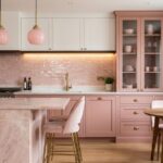
Warm Cream: Openness Without the Sterile Feel

If you’re worried that opening up your small kitchen means choosing cold, unwelcoming white walls, reconsider. Warm cream is your answer. This inviting tone reflects plenty of light while keeping your space from feeling clinical or stark.
Cream pairs beautifully with white or gray backsplashes, creating unified, harmonious designs without jarring contrast. The result is a kitchen that feels well-planned, not rushed.
Here’s what makes cream so effective: it visually enlarges your space when you use it on walls and cabinets alongside lighter flooring. Add natural textures like wood or woven elements, and you’ll enhance that warm, spacious feeling.
Even bold black appliances work wonderfully with cream. They soften and integrate rather than dominate, giving your kitchen balance and personality. You’ve found the right mix between openness and comfort.
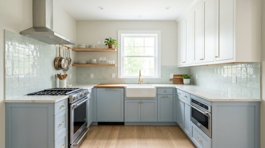
Pale Gray: Elegance With Light-Reflecting Power

How can you choose a color that’s both sophisticated and practical for your small kitchen? Pale gray delivers exactly that combination. This elegant shade reflects light brilliantly, making your space feel brighter and more open instantly.
Consider these ways pale gray works in small kitchens:
- Reflects natural and artificial light to brighten your entire space effortlessly
- Pairs beautifully with white backsplashes and light countertops for cohesive design
- Reduces visual contrast with dark appliances, creating seamless surface flow
- Complements gray-toned flooring for balanced, understated sophistication
Choose pale gray with cooler undertones for maximum harmony. You’ll notice how it works with existing décor while maintaining that spacious feeling you’re after.
Pair it with minimal chrome finishes and avoid heavy dark accents nearby. This approach keeps your small kitchen feeling larger, lighter, and undeniably stylish.
Light Taupe and Off-White: Subtle Warmth for Depth
While pale gray brings sleek sophistication, light taupe and off-white offer something warmer; a subtle richness that prevents your small kitchen from feeling cold or sterile. These neutral tones reflect light softly, maintaining that bright, open atmosphere you’re after. I’d pair them with white backsplashes and gray counters for effortless harmony. The warmth in taupe undertones reduces starkness, creating a space that feels genuinely inviting rather than clinical.
| Element | Color | Effect |
|---|---|---|
| Walls | Light taupe | Adds depth without overwhelming |
| Backsplash | White subway tile | Enhances contrast beautifully |
| Counters | Gray quartz | Grounds the neutral palette |
| Accents | Stainless appliances | Creates polished definition |
You’ll discover how these shades work together, making your kitchen feel unified and welcoming. The result is a space that feels larger and more comfortable.
Coordinating Your Paint Color With Flooring and Backsplash

Your paint choice isn’t an island; it’s part of a whole design story that includes your flooring, backsplash, and appliances.
When you’re coordinating your paint color with flooring and backsplash, you’re creating harmony that makes your small kitchen feel well-planned and unified. I recommend pulling inspiration directly from what you’ve already got:
- Match warm cream paint to a cream marble backsplash for visual continuity
- Echo darker gray walls with charcoal tile flooring to reduce visual contrast
- Coordinate light taupe walls with beige subway tiles for subtle warmth
- Blend off-white paint with stainless steel appliances for modern cohesion
This strategic approach is smart design. When your walls, floors, and backsplash work together, your space feels bigger and more connected. You’ll appreciate how unified everything looks when every element supports the others instead of competing for attention.